TicWatch Pro 3 Ultra GPS Review: The G-Shock of smartwatches
Mobvoi has been one of the main torchbearers for Google’s Wear OS platform over the past few years, offering everything from the budget TicWatch ‘E’ series to the more feature-packed Pro lineup. The company’s Pro models have shared the same basic design for several years now, with a dual-layer display that is still unique among smartwatches.
Last month, Mobvoi revealed the TicWatch Pro 3 Ultra with improved health tracking and a few minor hardware tweaks. There’s not much to get excited about with this new model, especially if you own the original TicWatch Pro 3, but it’s definitely still one of the best Android-compatible smartwatches you can buy right now.
| Specification | Mobvoi TicWatch Pro 3 Ultra |
|---|---|
| Build | Polycarbonate and Glass Fiber |
| Dimensions & Weight |
|
| Display |
|
| SoC |
|
| RAM & Storage |
|
| Battery & Charging |
|
| Audio | Built-in speaker and microphone |
| Connectivity |
|
| Software | Wear OS 2 by Google (Wear OS 3 update supposedly coming next year) |
| Other Features |
|
About this review: Mobvoi provided us with a TicWatch Pro 3 Ultra for the purposes of this review. Mobvoi did not see this review prior to it going live, nor did the company have any editorial input on this review.
Design and Hardware
The latest TicWatch Pro 3 Ultra is almost identical to the previous TicWatch Pro 3 in design. It’s definitely on the bulkier side, with a build similar to the Fossil Gen 6 and Samsung Galaxy Watch 4 Classic. The bezels aren’t raised around the screen, like on some other large smartwatches, but they still have time increments printed along the edge. I’ve never been a fan of numbers etched into smartwatch bezels, but it seems especially silly on the TicWatch Pro, because the ambient display only has a digital clock face.

TIcWatch Pro 3 Ultra (left) next to 44mm Galaxy Watch 4 (right)
Speaking of which, the TicWatch Pro 3 Ultra retains the same “dual display” technology that the previous Pro models used. There’s a standard 1.4-inch circular AMOLED touch screen for using Wear OS, but when the watch isn’t being used, the AMOLED is powered off and the watch switches to a monochrome clock that looks like any standard digital watch. You can re-enable the standard Wear OS always-on display in the settings, but then you’re losing one of the main features of the TicWatch.
Just like last year, you can also switch the TicWatch into a low-power mode that turns off Wear OS while maintaining the digital LED clock and some limited fitness tracking. This is helpful if your watch is low on battery and you’re hours (or days) away from a charger, but I honestly didn’t use it much.

Ambient display on TicWatch Pro 3 Ultra
The right side of the watch has two buttons — the top one takes you home to the clock face (or opens the app launcher, if you are on the clock face), and the bottom one is a shortcut key. By default, the shortcut button displays a list of workouts you can start recording, but you can set it to open any installed application. Holding down the top button opens Google Assistant, and holding down the bottom button takes you to a power menu.
Mobvoi still refuses to add a digital crown to its watches
One of my main complaints is that the TicWatch Pro 3 Ultra has no hardware scrolling mechanism. There’s no ‘digital crown’ on the side, which has been on Apple and Fossil’s smartwatches for years, nor is there a rotating bezel like the Galaxy Watch 4 Classic. Even though the side buttons rotate, it’s purely for decoration. Swiping through apps on a 1.4-inch screen isn’t a great experience, and I don’t understand why Mobvoi still refuses to add a digital crown to its watches.
The back of the watch has charging pins for power, plus an array of health sensors in the center. Like Mobvoi’s other wearables (and nearly every Wear OS smartwatch), the TicWatch Pro 3 Ultra uses a proprietary pin charger with a USB Type-A connector on the other end. There’s no wall power adapter included in the box.

Back of TicWatch with charger
Software
The TicWatch Pro 3 Ultra has the same Wear OS 2.x software that almost every other Wear OS smartwatch is running at the moment, with the Galaxy Watch 4 as the main exception (which has Wear OS 3). If you’ve used any Wear OS watch over the past few years, you won’t find any surprises here. The TicWatch displays notifications from your phone, tracks health data, and allows you to pick from thousands of custom watch faces on the Play Store. Some Wear OS 3 apps are also trickling down to Wear OS 2 watches, such as YouTube Music.
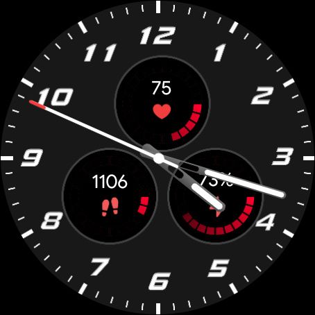
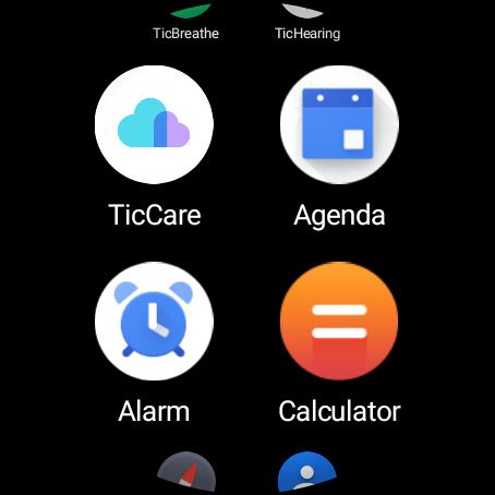
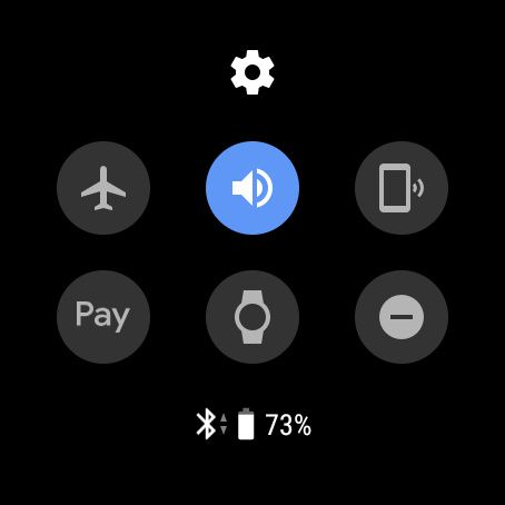

Mobvoi has made a few changes to Wear OS, though. The list of apps is displayed as a grid, with two icons on each row, instead of the simple list on most other Wear OS watches. Most importantly, Mobvoi’s own TicHealth is the main health tracking service. TicHealth is the only platform that can record data from the watch’s irregular heartbeat (IHB) and AFib sensors, but besides that, Google Fit works just as it does on all other Wear OS watches.
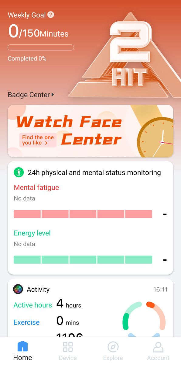
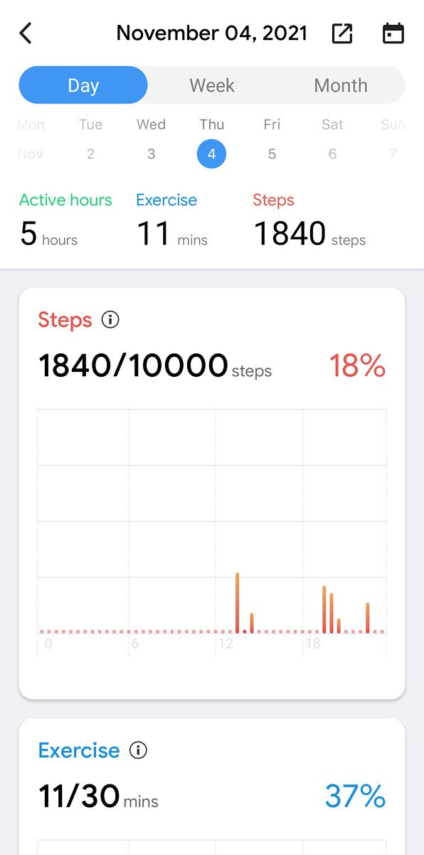

I didn’t notice any problems recording heartbeat data with TicHealth, but I also don’t have any professional medical equipment to compare the results with, so I can’t say for certain if the information is accurate. The rest of TicHealth functions similarly to Google Fit, but I did notice a few issues — exercises take a few minutes to sync from the watch to my phone, and the watch could never automatically detect some types of exercises (specifically, outdoor walks and cycling). Mobvoi has clearly done a significant amount of work to create its own health platform, but it doesn’t really seem any better than what every other Wear OS watch has with Google Fit.
Mobvoi (formerly TicWatch) (Free, Google Play) →
The TicWatch Pro 3 Ultra should receive an update to Wear OS 3 sometime around the “mid to second half of 2022,” along with the standard TicWatch Pro 3, the TicWatch E3, and the Fossil Gen 6. However, I will always advise against buying tech products before they have the functionality you want — if Wear OS 3 is a deal-breaker, wait until the update actually arrives, or buy a Galaxy Watch 4 instead.
Performance and Battery life
The TicWatch Pro 3 Ultra has the same Snapdragon Wear 4100 chipset found in the Fossil Gen 5 and TicWatch 3 Pro. That’s a step below the Wear 4100+ that you can get in the Fossil Gen 6, but the main difference with the 4100 is an improved AOD and low-power health tracking, which Mobvoi has mostly implemented by itself with its custom hardware. The TicWatch’s default Always-On Display is the digital clock that barely uses any power, for example.
I was able to get 3-4 days of normal use on a single charge
I didn’t notice any issues with performance on the TicWatch — most recent Wear OS watches have this same chipset (or something slightly better), so that’s not much of a surprise. Animations are smooth, and most apps open quickly. Only time will tell what performance will be like after the promised Wear OS 3 update.
Battery life was a pleasant surprise on the TicWatch Pro 3 Ultra. I have the Always-On Display enabled on all smartwatches I use, which is the main limiter on battery life, but the TicWatch’s secondary digital clock uses much less power than an AMOLED screen. I was able to get 3-4 days of normal use on a single charge (wearing the watch for a few hours each day, with occasional workout-tracking), which is an improvement over the 2-ish days I get with most other smartwatches.
Conclusion
The TicWatch Pro 3 Ultra is definitely one of the best Wear OS watches available, but there’s no denying that it’s a minor upgrade from the existing TicWatch Pro 3. The exterior uses different materials, and there are some minor hardware changes, but it’s not a radically different product. If you already have a TicWatch Pro 3, there’s probably no reason for you to upgrade to the Ultra.
The TicWatch Pro 3 Ultra is a minor upgrade from the existing TicWatch Pro 3
The main competition for the TicWatch is the Galaxy Watch 4 and Watch 4 Classic. I’ve been using a Galaxy Watch 4 as my main watch, and I definitely prefer its sleeker design over the bulkier G-Shock-like build of the TicWatch Pro 3 Ultra. Samsung’s latest wearables are also running Wear OS 3, while the TicWatch won’t get the update until sometime next year — assuming Mobvoi and Google live up to their promises. Samsung also has a slight price advantage, since the smaller 40mm Galaxy Watch 4 costs $250, and the TicWatch Pro 3 Ultra is priced at $300.
If you definitely want the TicWatch’s unique dual-display functionality, or you prefer the bulkier design, I can’t come up with many complaints about the Pro 3 Ultra. For everyone else, the Galaxy Watch 4 or Fossil Gen 6 might be a better option.
- Mobvoi's latest TicWatch is a minor hardware upgrade from the Pro 3, but it's still the only smartwatch with an LED clock mode.
The post TicWatch Pro 3 Ultra GPS Review: The G-Shock of smartwatches appeared first on xda-developers.
from xda-developers https://ift.tt/3otbSMf
via IFTTT

Aucun commentaire: