Chrome OS 82 tests a Material Theme redesign of the Files app and a revamped Linux terminal with tab support
Chrome OS has evolved a lot over the last several years, and Google is not stopping any time soon with the changes to attract both regular users and developers. In Chrome OS 82, Google is testing two major UI changes to the Files app and the Terminal app. First, the Google Material Theme redesign looks to be finally coming to the oft-forgotten Files application. Second, the Linux terminal is getting a fresh design and some much-needed settings.
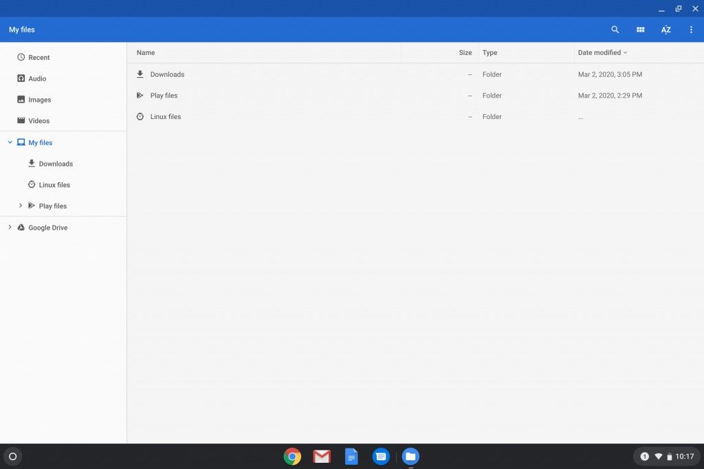
Let’s start with the Files app. Google has slowly added features to the default Chrome OS file manager over the years. It’s something you probably use a lot without thinking of it too much. Some of the major changes we’ve covered over the last few years include the ability to make Google Drive folders available for offline use, show Android app files, and add top-level folders other than “Downloads.” In Chrome OS 82, the Files app is getting a full-blown redesign in accordance with Google’s Material Theme design scheme. In summary, the top blue bar has been removed in favor of a more simplified white interface. We see the familiar Material Theme blue highlight in the sidebar and the fonts and icons have all been slightly altered as well. However, the functionality of the app itself hasn’t been changed in any major way. You can see how the design has changed for yourself in the before/after screenshots embedded below, courtesy of ChromeUnboxed.


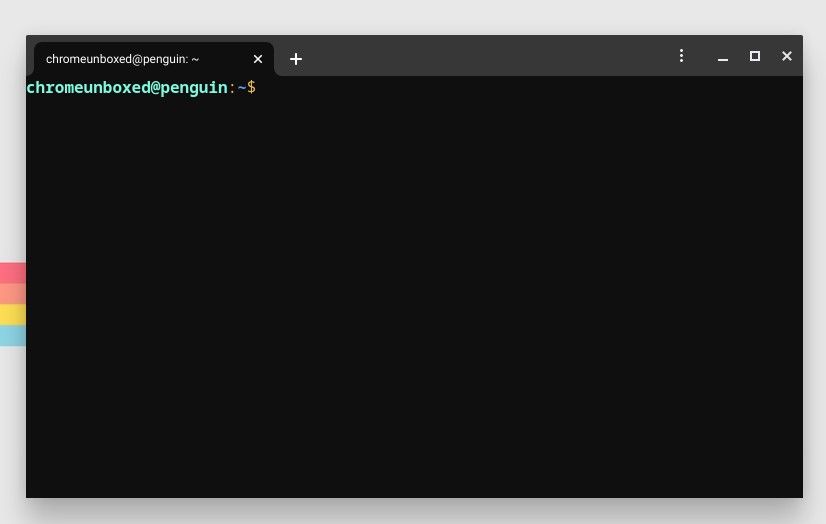
Next up is the Linux terminal, which is the portal to issue commands to the Linux container in Chrome OS. In Chrome OS 80 and above, that container is Debian 10 “Buster” by default. The Linux terminal has been very barebones from the start, but it’s finally getting a much-needed facelift. The interface in Chrome OS 82 is now tabbed, allowing you to run multiple instances in the same window. It looks much more like a traditional Chrome OS Progressive Web App (PWA) now.
Perhaps even more important is the addition of a three-dot menu icon and Settings page. The new menu gives users the ability to customize the color scheme, change keyboard and mouse behavior, and adjust the way the terminal itself behaves. The keyboard and mouse options include shortcuts such as Ctrl+V to paste and Ctrl+T to open a new tab. Terminal behavior settings include notification bells, encoding, and more. Users will no longer have to know or look up terminal commands to adjust these settings. Here are screenshots of the new Terminal, again courtesy of ChromeUnboxed.


These changes were spotted in Chrome OS 82, which is expected to arrive to the stable channel in May 2020. We’re excited to see Google take the Material Theme further and expand the user-friendliness of the Linux terminal.
Via 1: Chrome Unboxed | Via 2: Chrome Unboxed
The post Chrome OS 82 tests a Material Theme redesign of the Files app and a revamped Linux terminal with tab support appeared first on xda-developers.
from xda-developers https://ift.tt/2w43ICP
via IFTTT

Aucun commentaire: